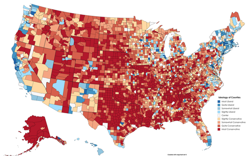
That’s because it’s one of those stupid maps that colors in districts without regard to population density. There’s a whole bunch of dark red empty land skewing the perception.
This sort of thing ought to be visualized with a dot density map or similar instead.

That’s because it’s one of those stupid maps that colors in districts without regard to population density. There’s a whole bunch of dark red empty land skewing the perception.
This sort of thing ought to be visualized with a dot density map or similar instead.