
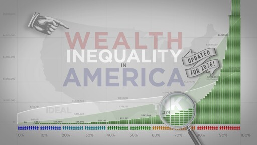
Updated in 2026, thirteen years after the original video went viral, we dive even deeper into the worsening inequality crippling our country. This video contains updated infographics on the distribution of wealth in America, highlighting both the inequality itself, and the difference between our perception of inequality and the actual numbers. The reality is worse than what we think it is.
The numbers might be outdated but the sheer dimensions - the reason this was created - are not:
Just keep your finger on the right arrow key.
One thing many people don’t understand:
We can have a world in which wealthy people exist, without handing nearly all money to the super rich.
Sorry for glomming onto your post, but this sheds extra light.
We can have a world in which wealthy people exist, without handing nearly all money to the super rich.
From a mathematical standpoint, that is correct. Politically, it can never be the case. The issue is psychological: the majority want the [financial] power to rule over others. Tis why capitalism remains strong.