
You must log in or # to comment.
I keep seeing all these charts in this sub and clearly lots of people haven’t studied how to present information properly. You can’t just put data out there with no axis or relative measurement and just slap numbers on it that’s just not good practice. If your graph can be misconstrued easily it’s a bad graph.
Boston at #2? Was this a survey by white people, for white people?
yeah lmao i wanna know how this was measured
It was measured by YA MUTHA! GO SOX!
I never see any of these map things that seem correct.
Caring for what?
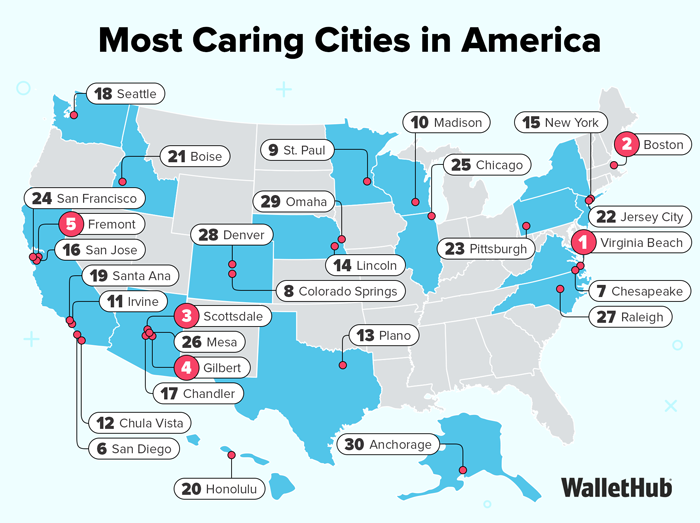
In order to identify the areas that care the most, WalletHub compared the 100 largest cities across 38 key indicators of a compassionate spirit. Our data set ranges from the share of sheltered homeless people to volunteering hours per capita to the share of income donated to charity.
There we go, that needs to be top comment.
Data provided by blinded children playing pin-the-number on the map at a birthday party.
“failed to load media”


